|
|
|
|

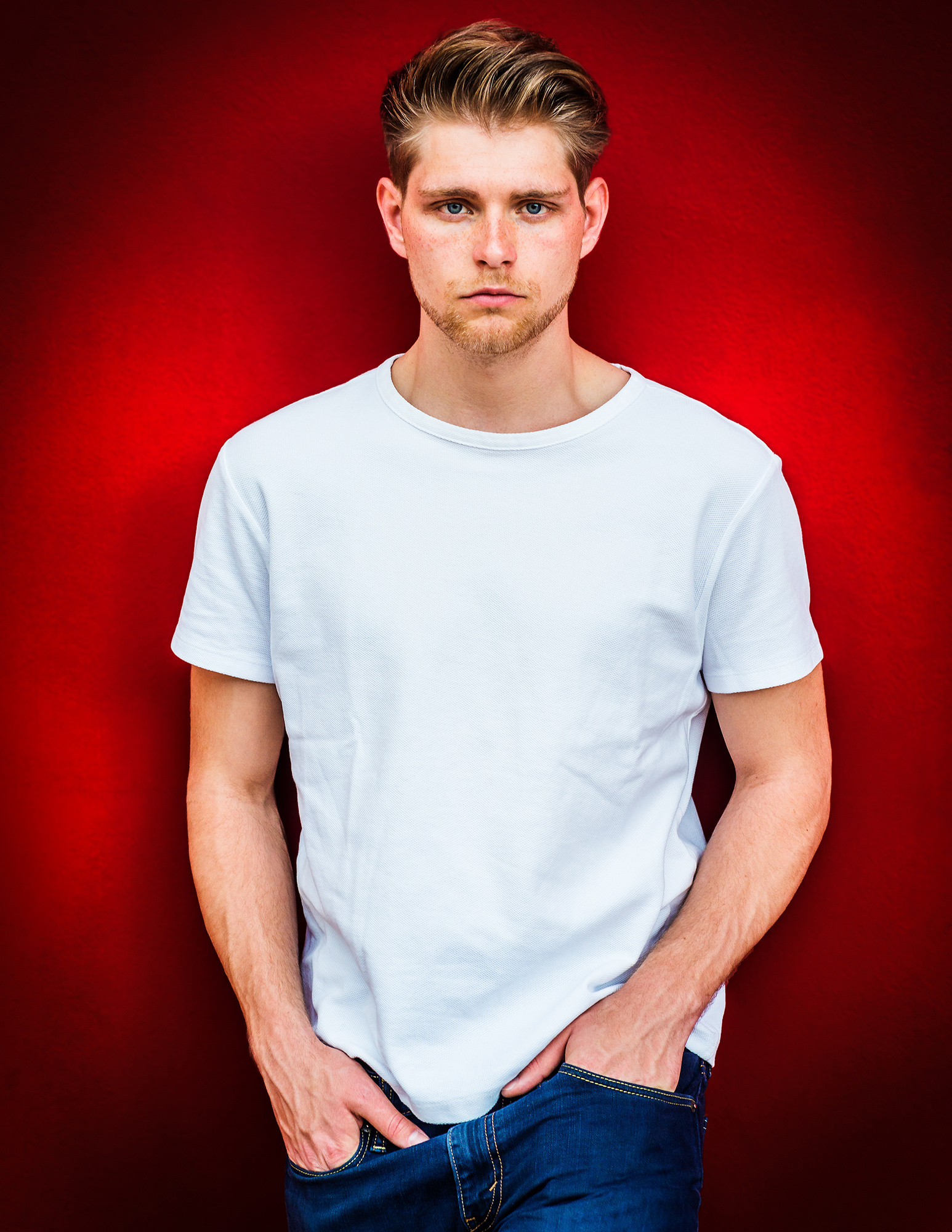
Title: Young Man
Description: Portrait of Young Man isolated on a red background.
This is a natural light and outdoor shooting. I like this portrait a lot. I like the model’s expression: innocence and seriousness. The red background reflects the positive attitude of youth spirit; I also like his pose, reflecting modern city body.
This photo is not selected.
Welcome any comments and suggestions. Thanks!
Xiao Cai,
Another strong portrait. I haven't commented on the four you have posted previously because I'm not a portrait specialist, and other, more experienced, Critics have offered their ideas. When I saw this photo, 'Young Man', the direct and serious expression and the hair style reminded me of a vintage photograph made by Paul Strand. His was notable for the intense expression that seemed to embody the spirit and the attitude of youth - healthy,strong, but a bit unsure, still lacking the confidence that comes with adulthood. The title of that photo is 'Young Boy, Gondeville France, 1951'. It's easy to find with Google, but I've put a link here in case you want to have a look. This is from a 2016 listing at Christies Auction.
https://onlineonly.christies.com/s/eclectic-eye/young-boy-gondeville-charente-france-1951-56/31359
Your photograph is a good portrait in my opinion. The colours are strong, but from reading the descriptions and replies you've written I understand that is a style you like. The vivid red background creates a mood for the portrait. The casual pose works, and the expression is interesting - serious, direct, neutral. The only suggestion I'll make is that the shirt could have a bit more texture. That would require darkening it a little. I know you like strong tones, and editing decisions are yours to make - but photography has become so technical that viewers have come to expect a perfect and complete range of tones. They pick out dark shadows and bright highlights and see them as editing flaws. My advice on that is to trust your instincts, edit for the theme, and let viewers think what they will.
Thanks for sharing your work here in Critique. It would be useful if you could provide the exposure settings - focal length, aperture, shutter speed, and ISO. That information is useful as we analyze how a photo was created - and we learn from it at the same time. Many members come to this section not to post photos, but to read the opinions and to learn technique. A short description of the editing process is useful too.
. . . . Steven, senior critic
PS: Paul Strand made a famous photograph of Wall Street as well . . . . I just remembered that.
Hi Steven, Thank you for your comments, information and suggestions so much! I appreciate it

Hello, Xiao
I have read through your description of the image and the reply of Steven T. I mainly thinks in a similar way as he does. I do not want to repeat his ideas but I would like o share some of mine. Well, I mainly work on Still Life photography in an artistic way. I am trying to improve my hand on portrait photography as well. There is actually quite a resamblance between shooting Still Life and Portraits. The subjects are both standing opposite your camera :).
One thing I would like to share is about the composition. As far as I am concerned with shooting models, cropping right below a limb is not recomended. That could have been avoided here. The space above the models head is not bad. It is good to have there little space. The sharpness of the eyes is great. Your model except the loss of texture on the t-shirt is what is expected from a portrait for stock sites. Here comes my question. What do you think would have changed if the model were not so sharp from head to bottom? I think the image would have been more artistic. And I suppose 1x curators like artistic images more. This is my personal observation.
Another aspect I would like to emphasize is the strong background color. I know you like to pop colors. This is your image. You have all rights to do what you want. However, as something did not add up with the curators, it still remained your image. If it were published, it would have reached much more people. So its time to think again. I think the brightness and the strength of the red background caused the loss of texture. It is also too dominat for a portrait with the feeling you want to achieve. That's what I think. It looks more important than the model. Is it?
Well, keep on shooting images and soon there will be more published and maybe awarded. When you improve things definitely get better. Have good light.
Hi Cicek, Thank you for your comments and thoughts! I appreciate it!
Thank you...
..
