|
|
|
|
Hi,
Please give me some advice and critique of my recent "Not selected" photo for the futre reference.
I think that even if I correct this photo, it is difficult to be published, because the score was awful (1%).
At least, I want to have advice for future reference.
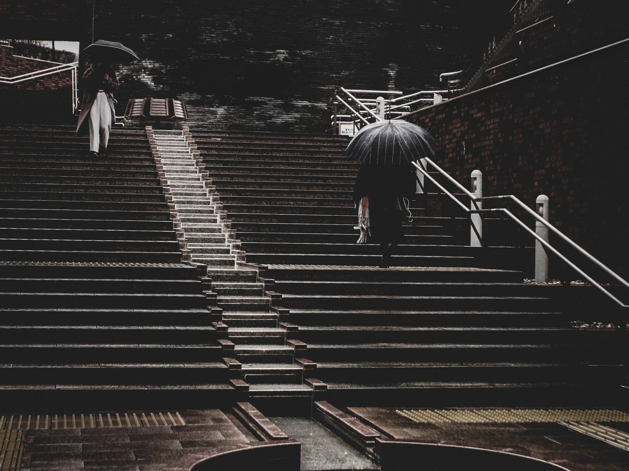
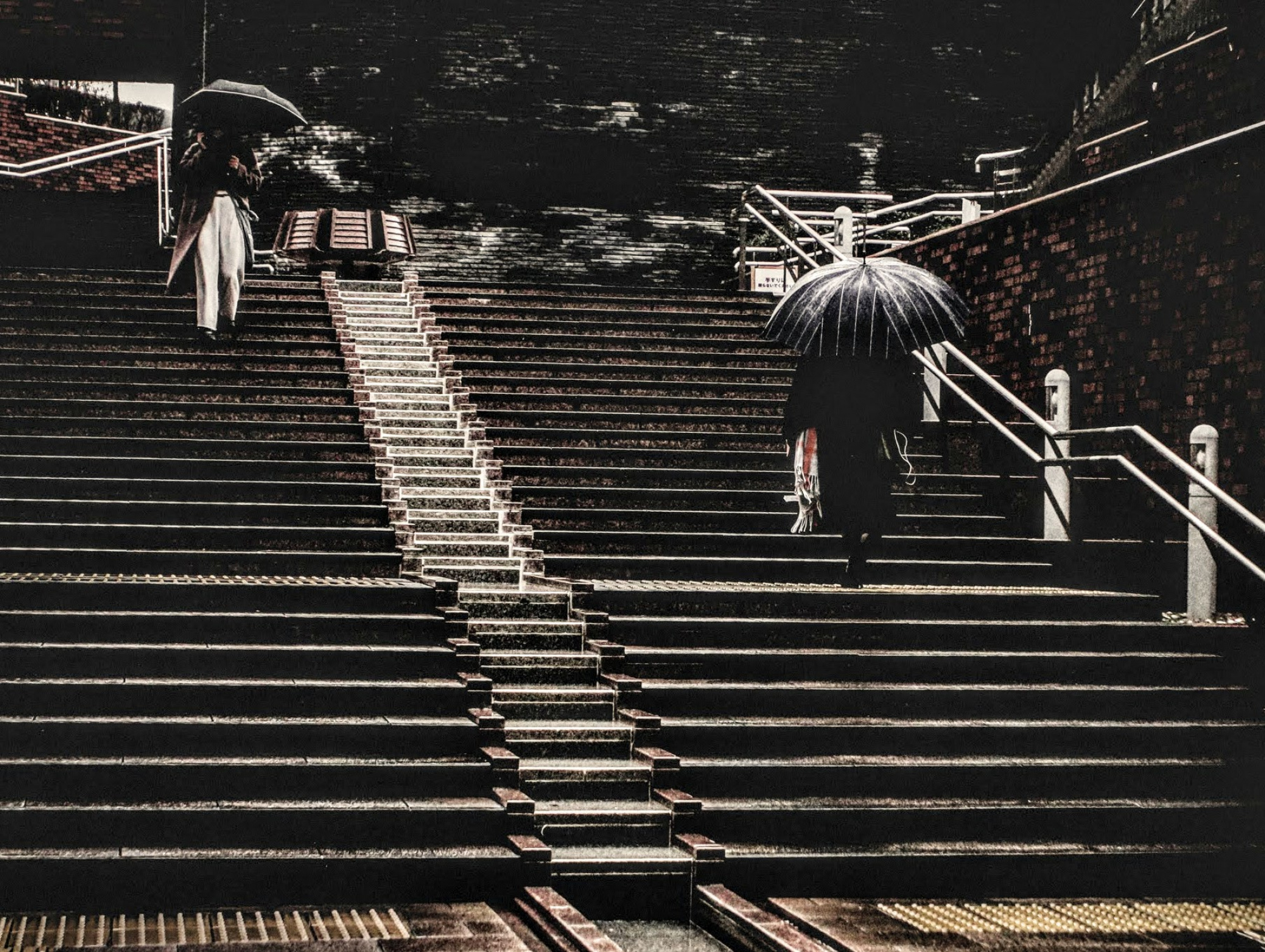
I took this photo when I have been walking around the town in raining. I found that two people are about crossing each other, one is going down and the other is going up stairs.
I felt interesting the two, who are unknown each other, are crosssing.
My concept for this photo was as follows:
- Enphasize leading lines (center and right) which indicate the two person's moving lines.
- Remove unneccesary objects: there was two lamps on the wall, on top-center.
- Darken meaningless white part; wall on the top-center, and upgoing white line on right.
I thought that the movements of two persons are focused by these retouching.
Here is some information about the photo.
ISO 100
1/1600 sec
Using Adobe Lightroom
Repeatedly I want say that this photo won't be published even if I corrected; I just want critique to verify my approach would be good or not.
Thank you.
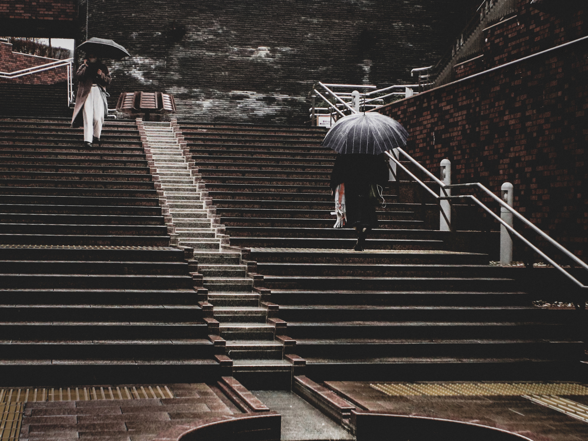
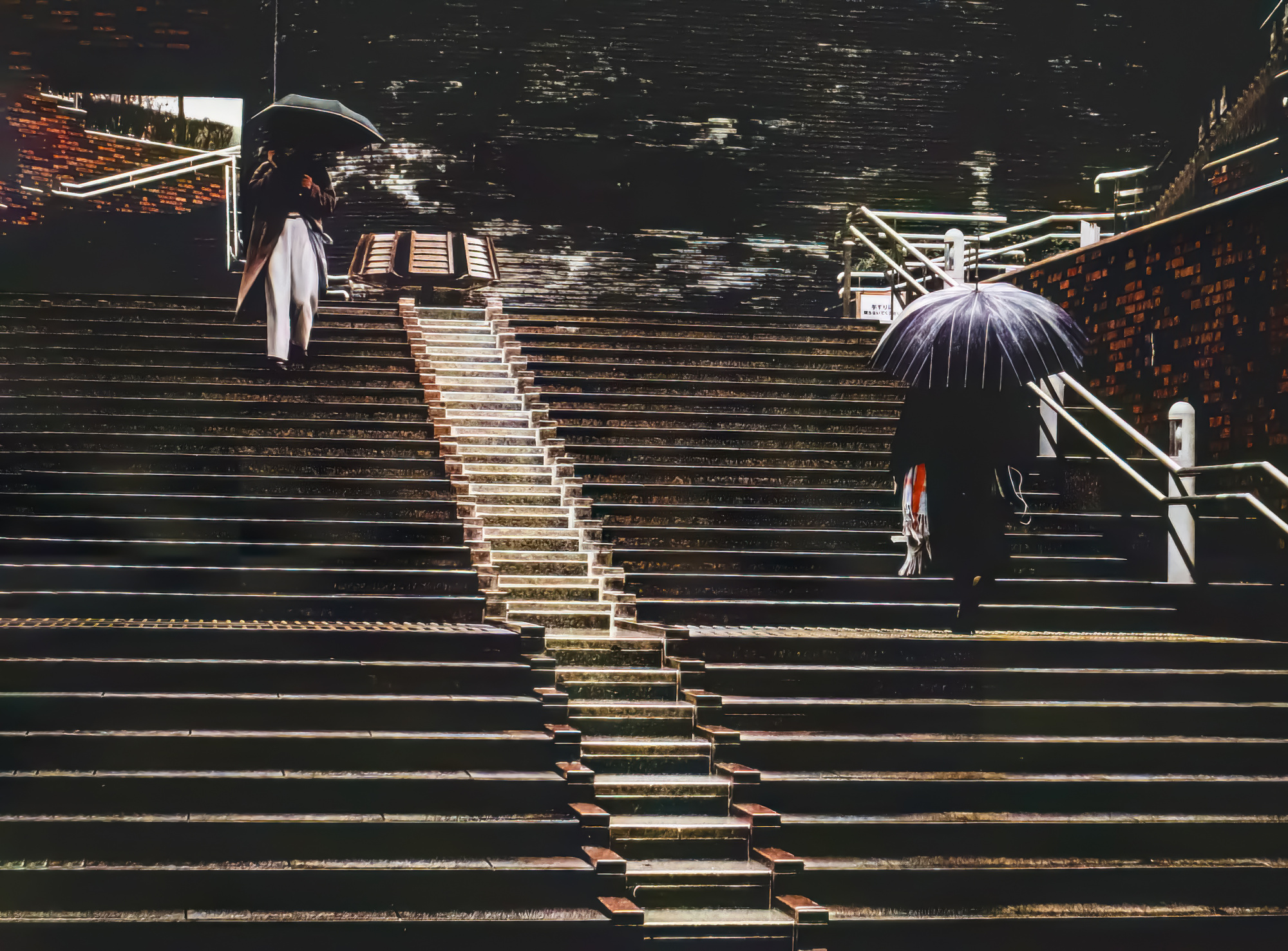
Hi welcome back I will jump right in - Composition and balance hold together vert well. - For my eyes it's the processing that takes this image down to a very dark place. It has that under exposed look about it. Just look at the black area's very black with no texture - Many people who vote will see this as a major fault of the photographer. That will end up with very low percentages and an image not selected. I hope this helps...
Daniel,
Thank you for your reply.
Yes. I got it. Maybe that's the wall on the top.
When I retouched the photo, I thought that this dark place would make other part focusable, and somewhat express the good mood.
But now I see the whole picture, the darkness of the wall is too strong.
I did it too much.
There's no hope on this wall. This is dead-end. It's not what I wanted.
Probably I took care of composition (or something not so important) too much, and I forgot to see whole image...
Your critique helps me so much. Thank you.
I think now it's better than before...

Hello nekogesku
Welcome back and thank you for sharing this street photo with us. To me it has great potential, and you have already had some good advice from Daniel. What struck me, however, was that the curves at the bottom of the frame were distracting as all the other patterns are straight lines - even on one of the umbrellas. So I cropped the lower frame and then the right side just to maintain the ratio. I lightened the image a little, but I like the tones. I definitely also like the moment, especially as both people are holding up umbrellas.
All the best, Elizabeth
Elizabeth,
Thank you for your critique and advice.
Your retouch is very good.
As for the curve at the bottom, I didn't removed intentionally; it's because I found the shape interesting, and because the curve would represent the start point of person going up.
However, at the same time, I felt something not simple in this picture, something complex and felt anoying.
Maybe it's because there were lots of objects in the frame.
As you mentioned, removing the curve would solve this.
Thank you for your critique, Elizabeth.
I also learned that to simply the frame is important for the street photography, too.
Thank you a lot for spending time.
Dear Nekogesaku,
Thanks for submitting your photo to the critique forum.
I fully agree with Daniel comments, yet even if the quality would be and lighting would make it publishable, I would still make few changes regarding the composition.
I took your photo to Photoshop firstly I reduced the photo on the right side and added an additional area on the left side to have the lady going down and the lady going up in a similar distance from the frame. I used the horizontal ruler on the top left and then: Edit – Fill - Content Aware.
I personally prefer to have more focus on the ladies on the stairs. So, I also cut the bottom up to the stairs.
It is of course just my opinion.
Best regards
Arnon Orbach Senior Critic
Arnon,
Thank you for post. Sorry I didn't noticed your post.
I found your re-touched work more dramatic, and I love that.
Also well-balanced ... how nice.
Adding the additional area, that's totally new and good idea to me.
Thank you, and sorry again not being noticed.
