|
|
|
|

Hi everyone,
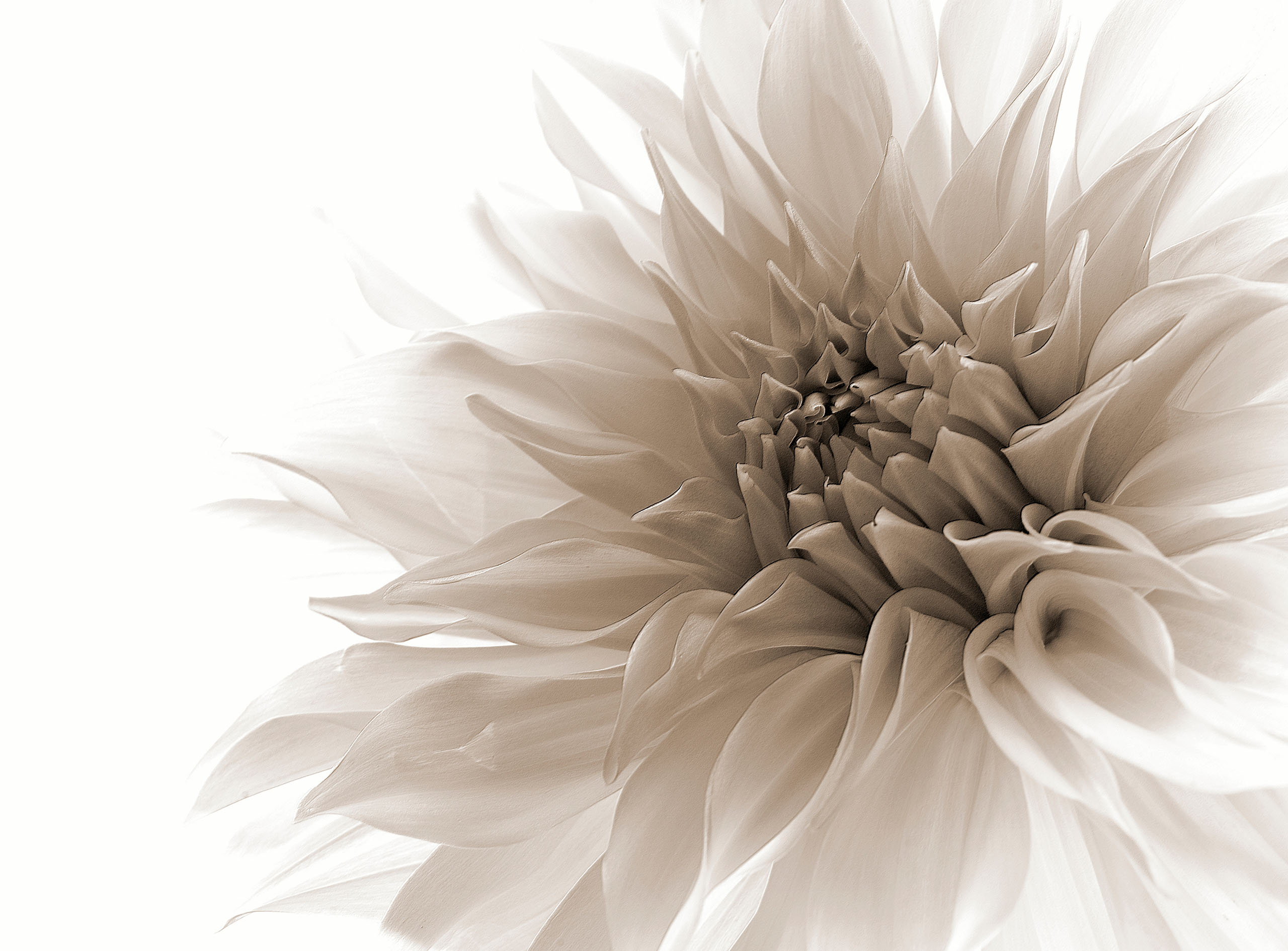
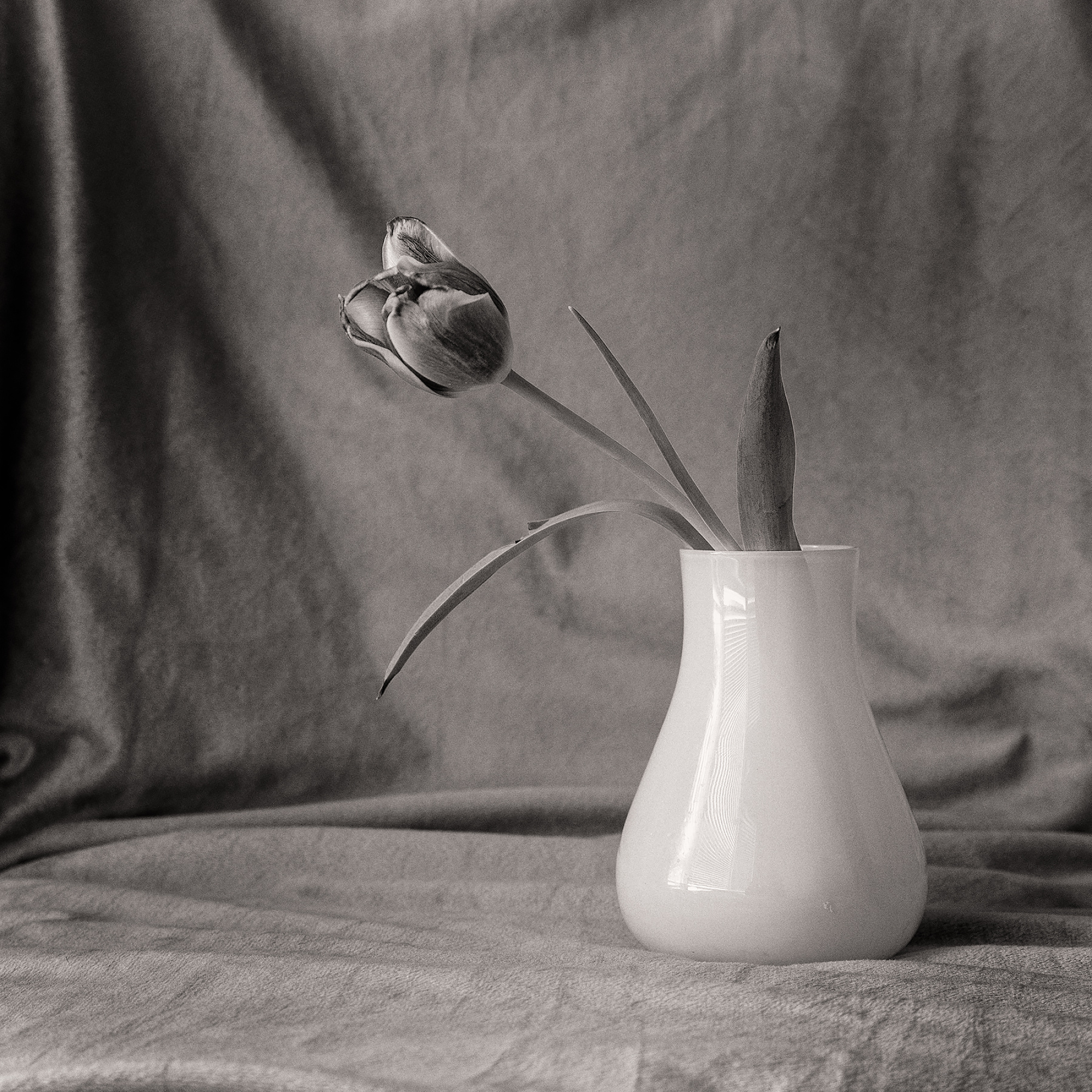
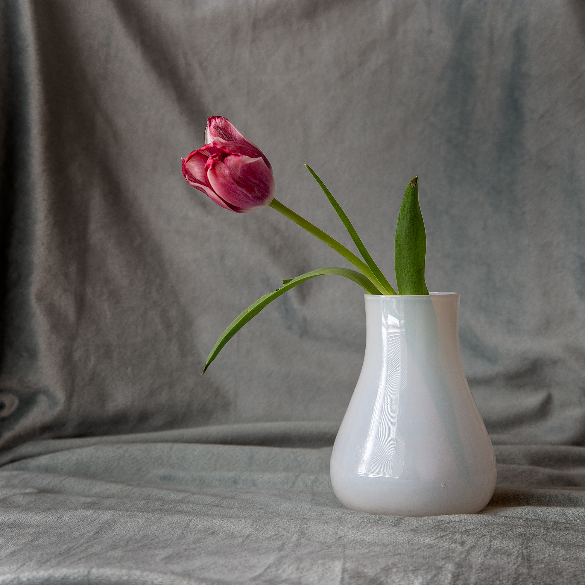
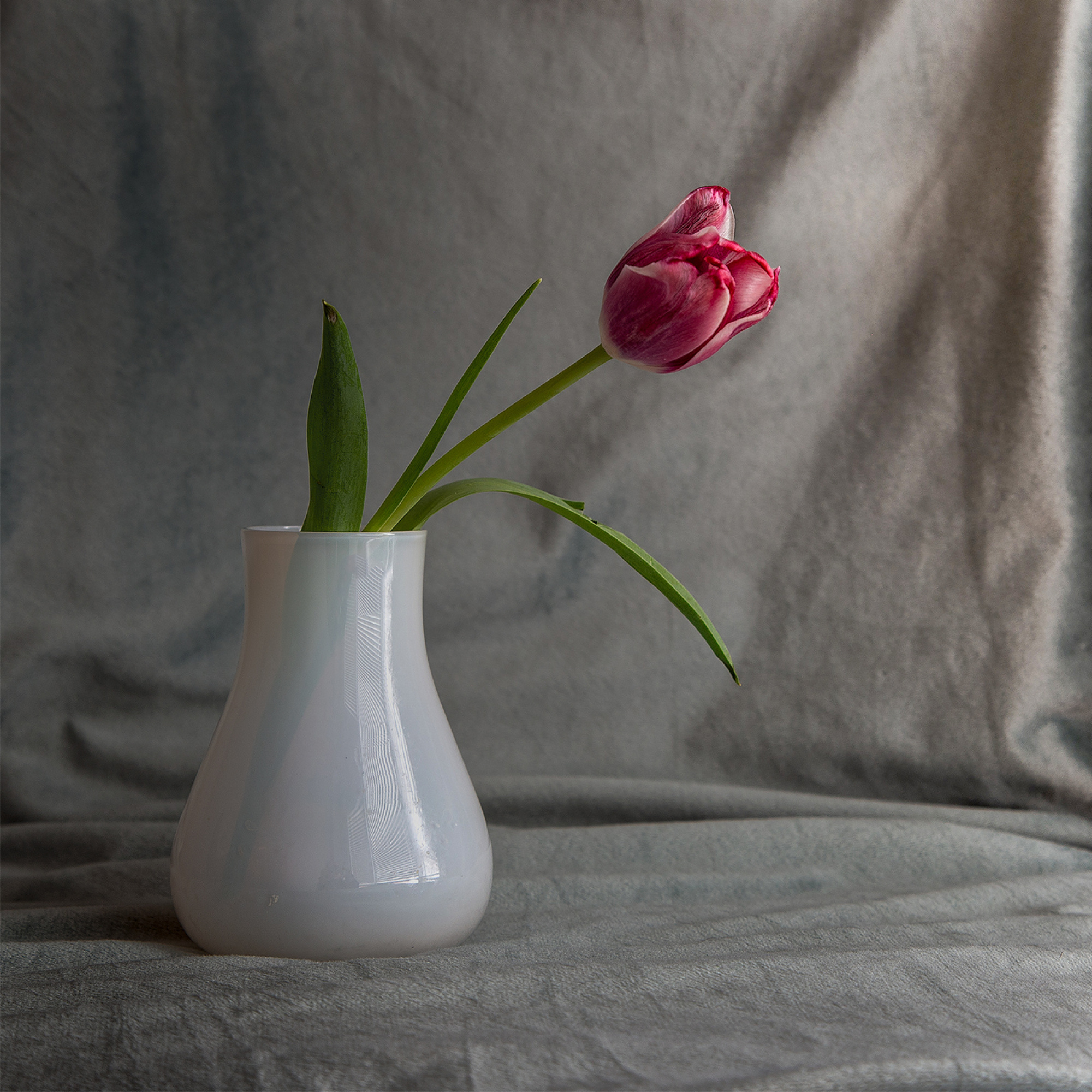
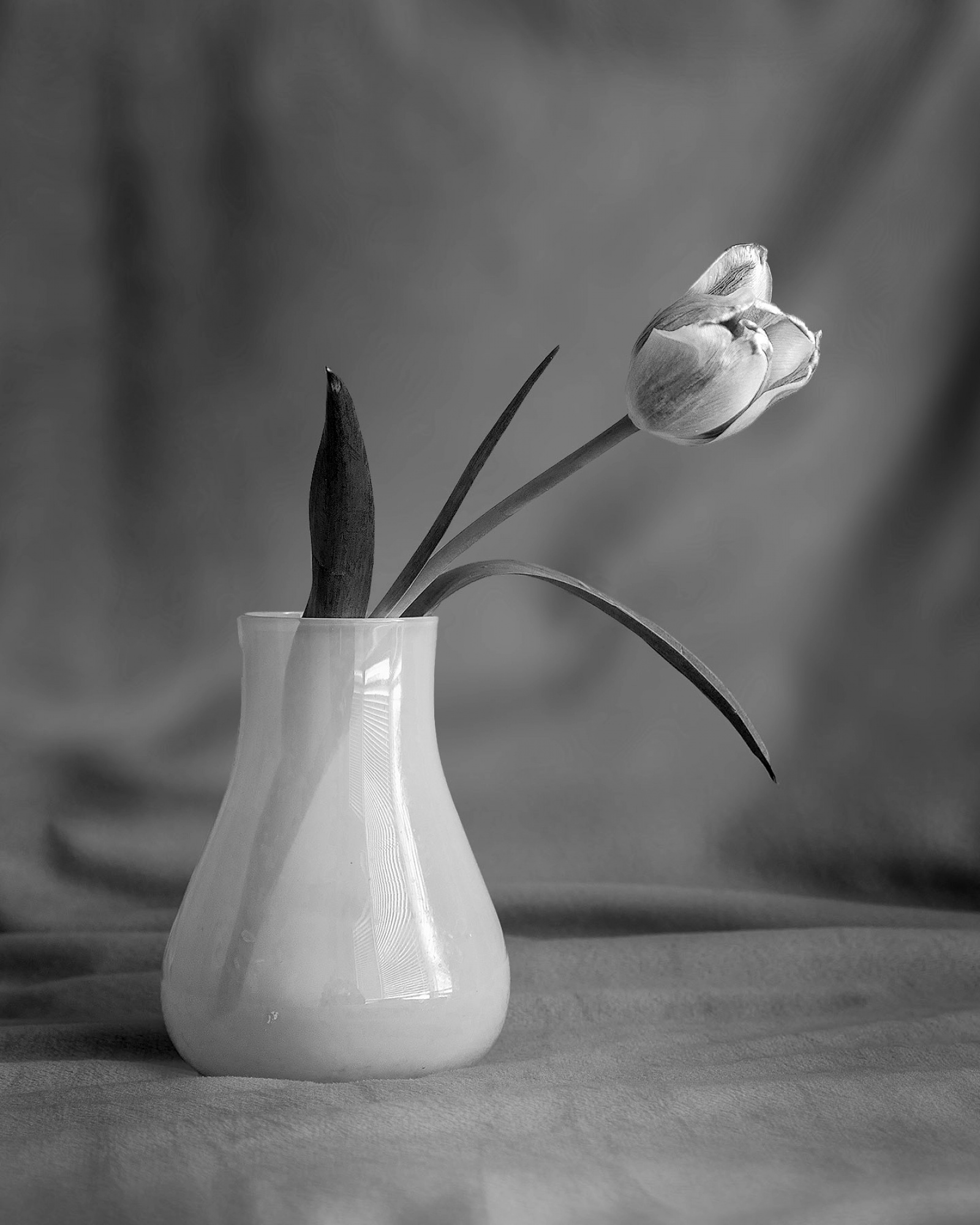
It's been a while since dropping by :) . I did this simple image using natural light, ISO200 f8. I have two versions, a colour and a sepia one. I am looking on how I can improve this. I want to keep using natural light, so maybe a different vase or fower? different composition?
Thought, critique, suggestions are welcomed.
Thank you
Calin
Hello, Calin
Welcome to our forum and thank you for sharing your image with us. Generally the composition, foreground, subject placement and background looks great. The light is sufficient as a natural source. To enhance this setting I advice you a radial gradient around the vase to enhance the subject. Before applying it please invert it. Then drag the exposure slider slowly to minus and stop when the subject becomes more prominent. Then soften the outline by decreasing texture and clarity just like we did with exposure. Just slightly. Afterwards choose subtract from mask and with a brush erase the round edges to fit your eye. I would do it on a screenshot but I am away from home and I only have my phone with me. The aim is to enhance the mood by bringing the subject better to sight. Leaving the subject better lighted and sharper while the background gradually darkens and becomes softer. If you can I advice you to look at my still life images in my portfolio. I wish you good luck light ... Cicek
Calin,
Nice to see work of an old Critique member. All the best for you. And Cicek gave already a nice comment. Theo L.
Collin,
I also played a little bit with your composition. I turned your composition but I also changed with the gradients in camera raw the incoming light. And nice to see the steel is also visible in your vase. Theo L.
Hi Calin,
Good to hear from you again! Hope all is well with you and yours. How about that hockey game, eh? Oh Canada!!
Tulips make good subjects. I've tried them a number of times over the years. I like the simplicity of your composition and colours. It seems a very still and elegant scene like the kind photographers would notice more than others.
Cicek offered good suggestions for more separation of subject from background. Another approach would be to add Blur to the background for a smoother look. As it is the texture of the somewhat chaotic background makes a strong contrast to the smooth, natural perfection of the subject - you may have wanted it that way to show the difference between Nature's work and Man's, I don't know.
With Photoshop it's possible to select the subject and then invert that selection so that you can work on the background without changing the subject. 'Select>Subject' does most of it, but the Quick Selection brush can fine-tune the selection. Hold down the Alt key to subtract from the selection area, or the Shift key to add to it. To invert the selection, use 'Select>Inverse'.
To blur the background for this sample edit I used 'Filter>Blur Gallery>Field Blur'. The History Brush can restore sharpness to the foreground at the base of the vase. Another way to blur a background is a relatively new tool in Photoshop - 'Filter>Neural Filters>Depth Blur'.
The corners were darkened with the Burn tool, and some of the darker shadow areas in the background were lightened by Dodging. It's handy that the Dodge or Burn tools can be set to Shadows, Midtones, or Highlights.
I'm sure you know these techniques already, but there may be other members reading along who don't.
Like Theo I thought a left-to-right flip would work.
. . . . Steven


Hi, mate, how are you? :)
Thanks for sharing.
Quick feedback, nice props to start with.
1. You should keep using natural light ( That's a nice thing that you've mentioned that )
2. Next, try to opt for a "cleaner" background. What I mean by that is the material or fabric you are using; try to make sure it won't interfere or distract the viewer's attention from the main subject. (There are different tints on the fabrics)
3. The colored version looks quite nice ( Personal opinion )
4. Try to play with a reflector if you do have one.
If not, you can easily make one ;).
A white foam or bristol paper would do. Put the white reflector on the opposite side of the vase ( against the light source ). This will give a soft light to the vase(left side), making it more appealing and detaching from the background.
Cicek Kiral thank you for your suggestion, I need to make the subject stand out more.
Steven T , Theo Luycx it's great to be back here, things are good with everyone. I took a break, and now I'm slowly coming back. I love the flipped image, and I wonder why I didn't try it. A softer background is nice, so I might shoot with a different lens (maybe I'll try an f5.6-f8 with 200mm). Playing wiht some filters and masks, I could get more details out, like make the stem stand out better. Thanks again for your great suggestions, as always.
Yannick Apollon nice of you to stop by :). I like to play with natural light, a reflector is a good idea, plenty of carboard around I can glue white papers on.
Cheers,
Calin
