|
|
|
|

Hi brains trust,
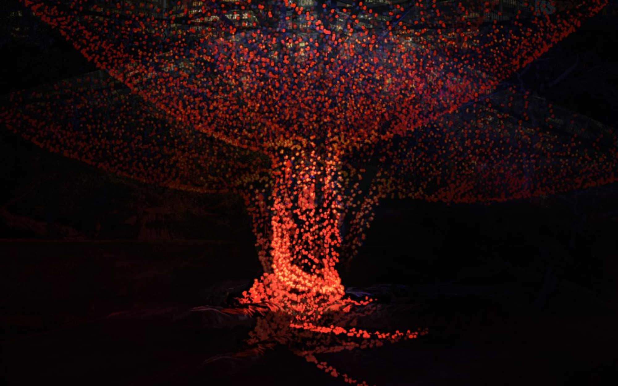
I am seeking some tips on how to improve this abstract image. This is a new genre for me, so I need some pointers.
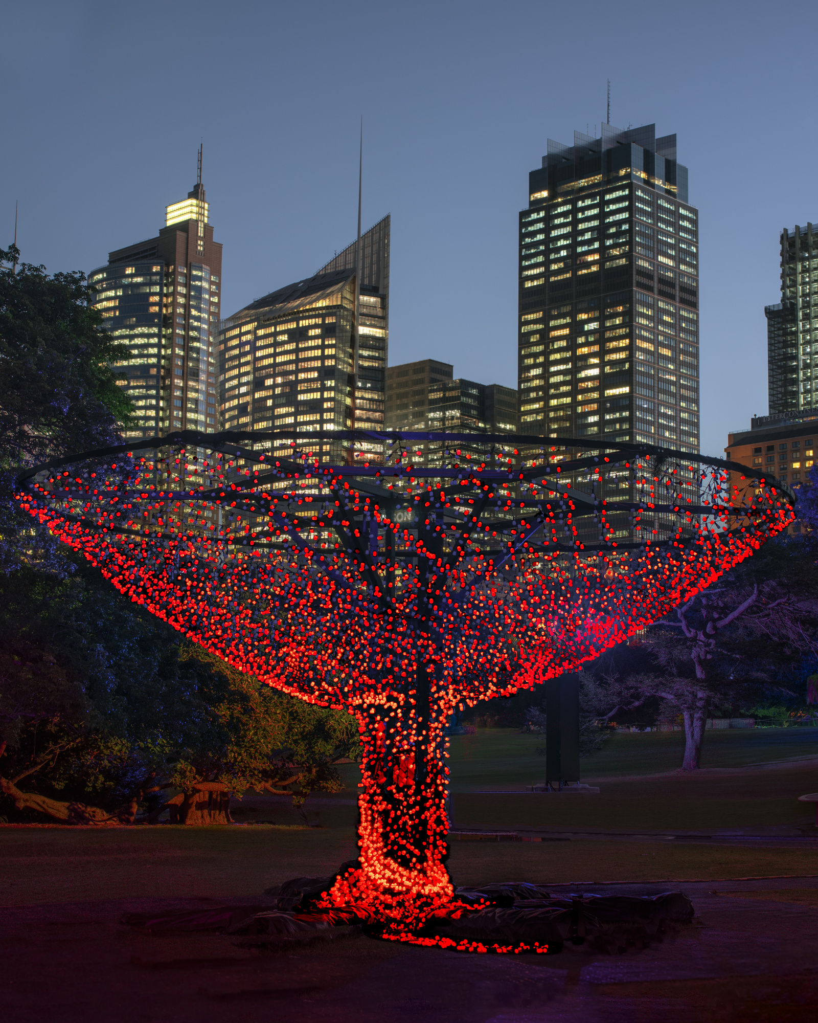
I thought the idea wasn't bad but noticed 'originality' as an area for improvement in the comments. Granted, a red goblet idea is not that original at Lent per se, but surely my take on it was? What else could have done to improve it? B+W edit on the background? A scratch dust layer to add interest? Or was the overt symbolism just too polarising in the end?

Hello Peter,
Definition (Wiki)
"An image is abstract above all when it conveys feelings and emotions through allusions or figurative elements, detached from the depiction of real objects and images."
According to this definition, your picture is not abstract - but I'm not an expert on that.
Nevertheless, I would make the picture more mysterious and have therefore made your picture much darker - as if you had taken it at a later hour.
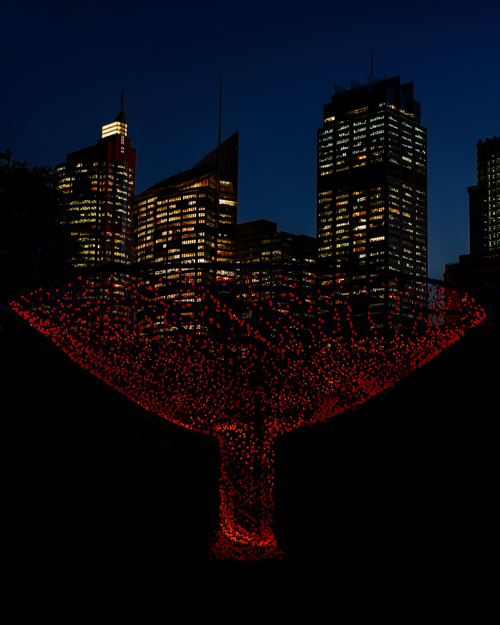
Imo it comes a little closer to the abstract.
Greetings
Udo
Peter,
Thank you for posting the photo here in Critique Forum. The juxtaposition of the red object (sculpture or art installation artwork?) and the city skyline is an interesting one. The photo is carefully composed to show those two elements with no distractions.
I agree that 'Abstract' is not the best category for the photo. Unfortunately the 'Conceptual' category was not kept when 1X had its big update a couple of years ago. I'm not sure how important the choice of category is when a photo is judged, but I think stating that a photo is 'conceptual' may have helped to slow some viewers down to consider a photograph's message or meaning.
Abstract is not easy to define. The definition Udo gave above is good. Here's another . . . . Alvin Langdon Coburn in 1916 proposed that an exhibition be organized with the title "Abstract Photography", for which the entry form would clearly state that "no work will be admitted in which the interest of the subject matter is greater than the appreciation of the extraordinary." Some photographs insist that the subject matter must not be recognizable for an image to be abstract.
Does the photo have a title? Titles can send a message to viewers that there is some symbolism to be interpreted, and a theme to be discovered. If your photo were titled 'Skyline' or 'The City at Night' the red goblet would be an interesting foreground detail - but not a symbol. If the title were 'The Blood of Christ', or 'Repent', then viewers might look deeper, and possibly even think. That could lead them to discovering a theme like the contrast or disharmony between Religion and Modern Civilization as represented by the two elements in the image.
I've no suggestions for further editing of the photo. I like Udo's idea to make it darker for more mystery and abstraction - but much depends on what you want the photo to say to viewers.
. . . . Steven, senior critic

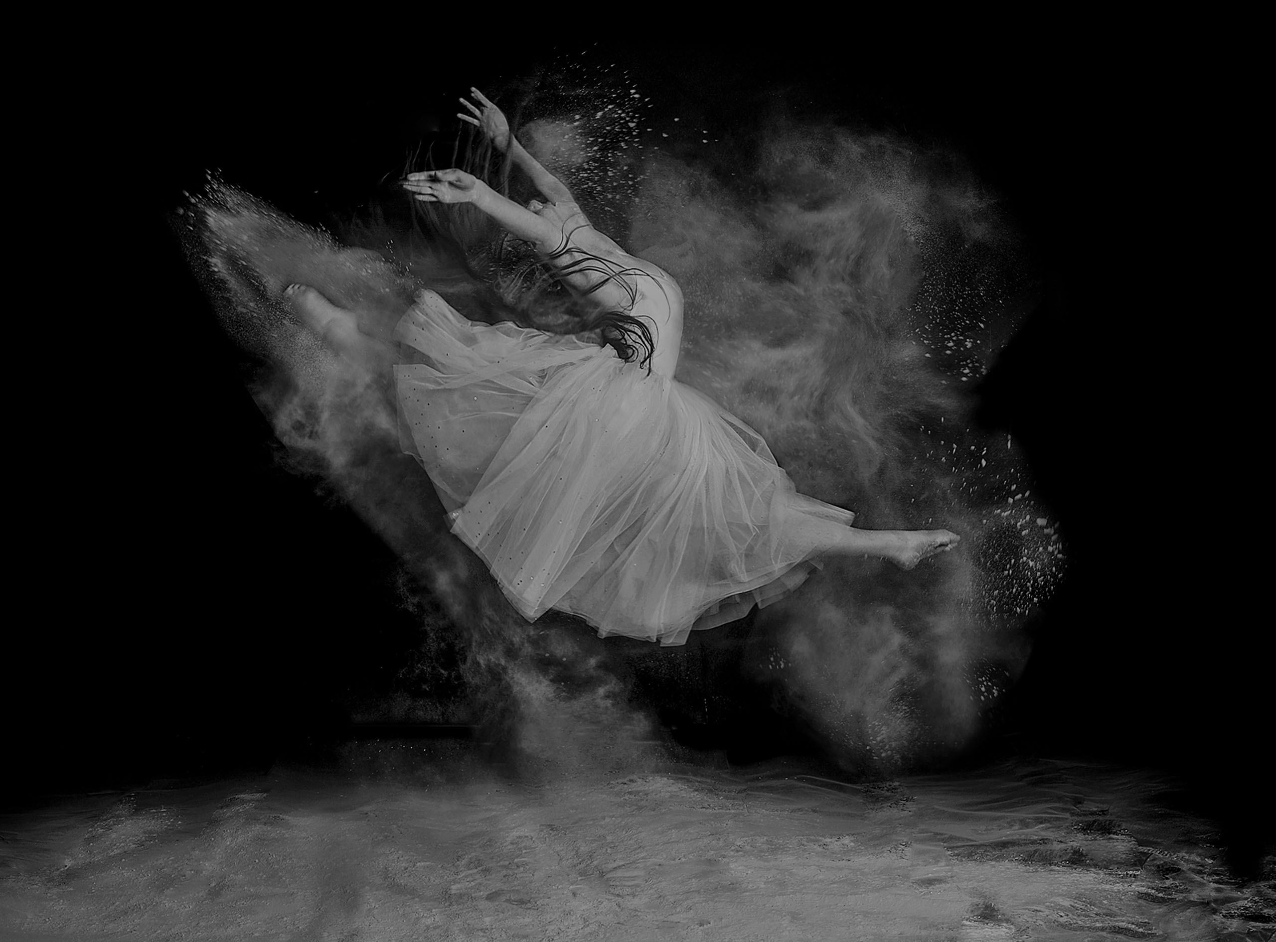
Hello, Peter
Welcome to our forum. You asked for advice to improve this abstract image of yours. However, I agree with my friends in the difficulty to categorize this image as an abstract one. So, based on the comments above and the reqyest to improve this image as an abstract one, I took a screenshot and cropped the image to just reveal some part of the red goblet. Then I darkened the background in Camera raw. Afterwards I made two copies of the image as layers and changed there angles to about 45 degrees. one bent to the left and the other to the right and used the screen blending option. The result I received looks like an abstract image. The composition could definitely be improved but my aim was to reach an image that could fit the "abstact " genre. I wish you good light...Çiçek