|
|
|
|
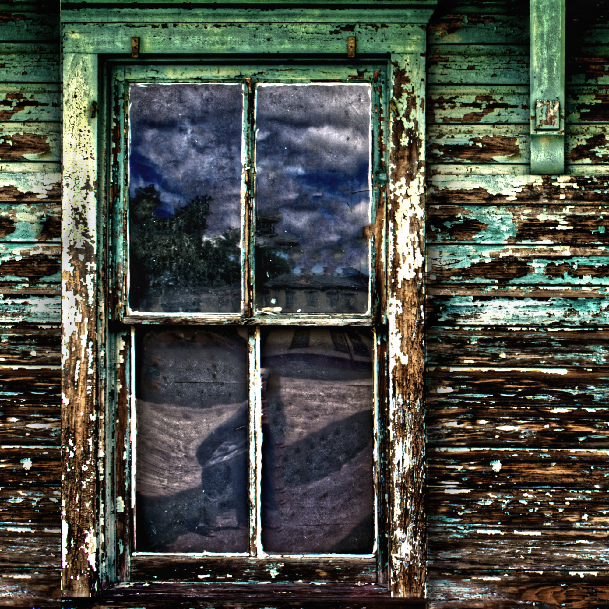
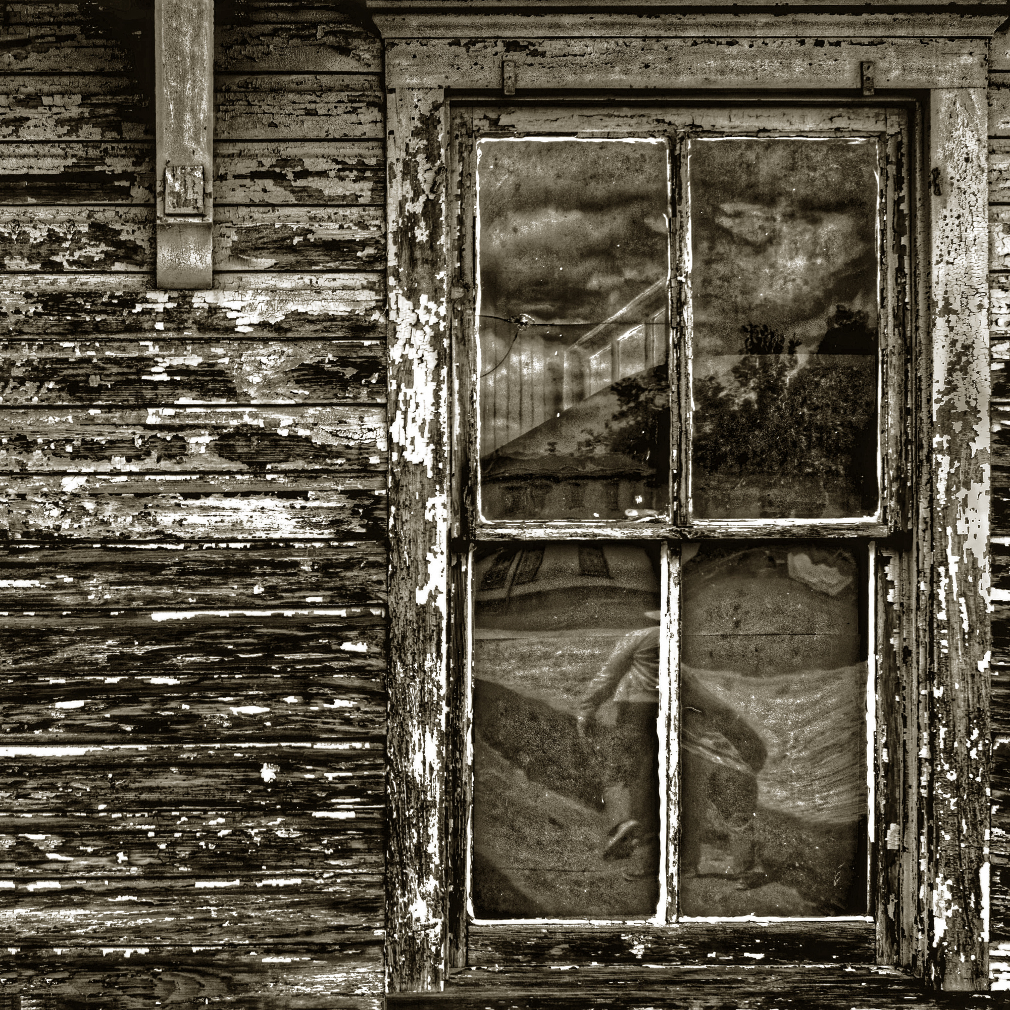
I took this image a few weeks ago in Roebling, New Jersey. Roebling is a town created by John A. Roebling Company, the designers and constructors of the Brooklyn Bridge, to house employees of the mill. This is one of the few remaining structures on the site, I believe it was used by the employees to clock in and out during the various work shifts.
I thought the reflections in the old windows presented some interesting food for thought. The buiding was construtecd circa 1900, so these panes of glass have captured many reflections over the last 120 years. Interesting web site if anyone is interested in learning more about the town.
I would appreciate any comments regarding the image and the presentation here.
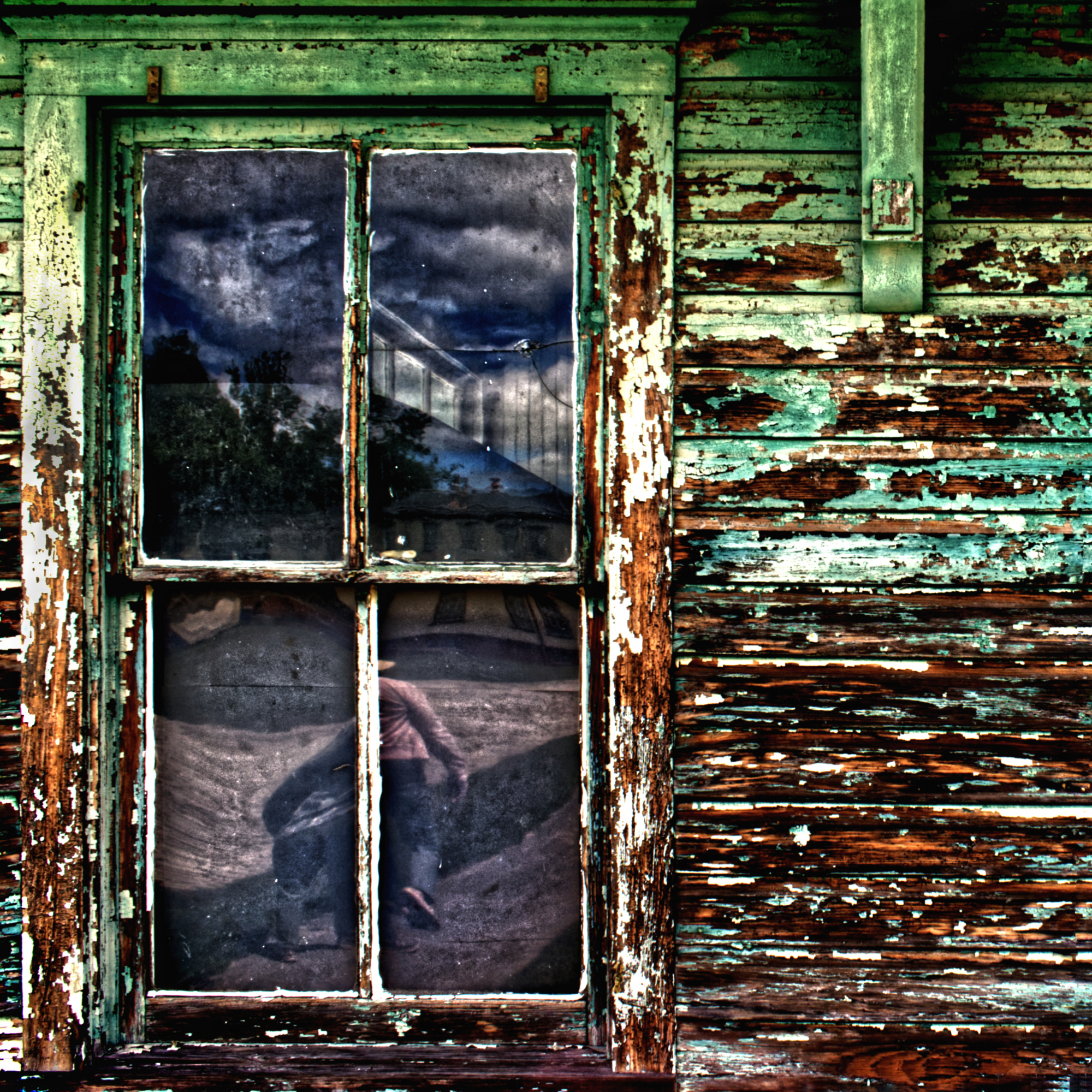
1/125, F8, iso 320, F18. Affinity software.
Thanks for your time,
Patrick

Hello Patrick,
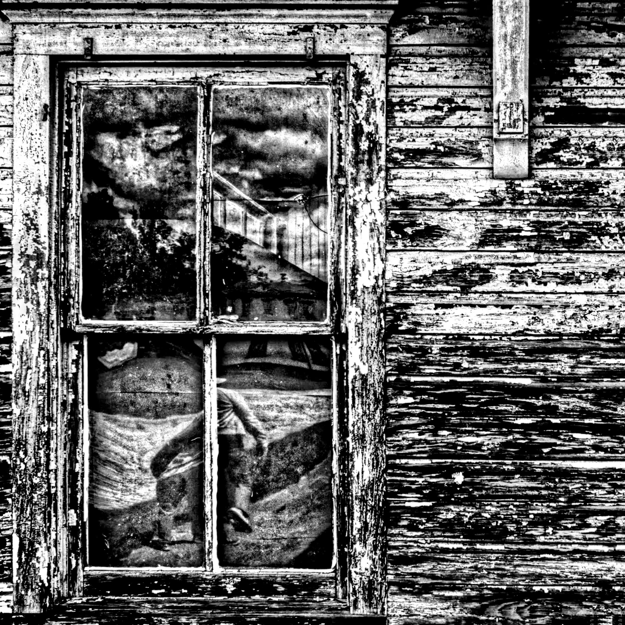
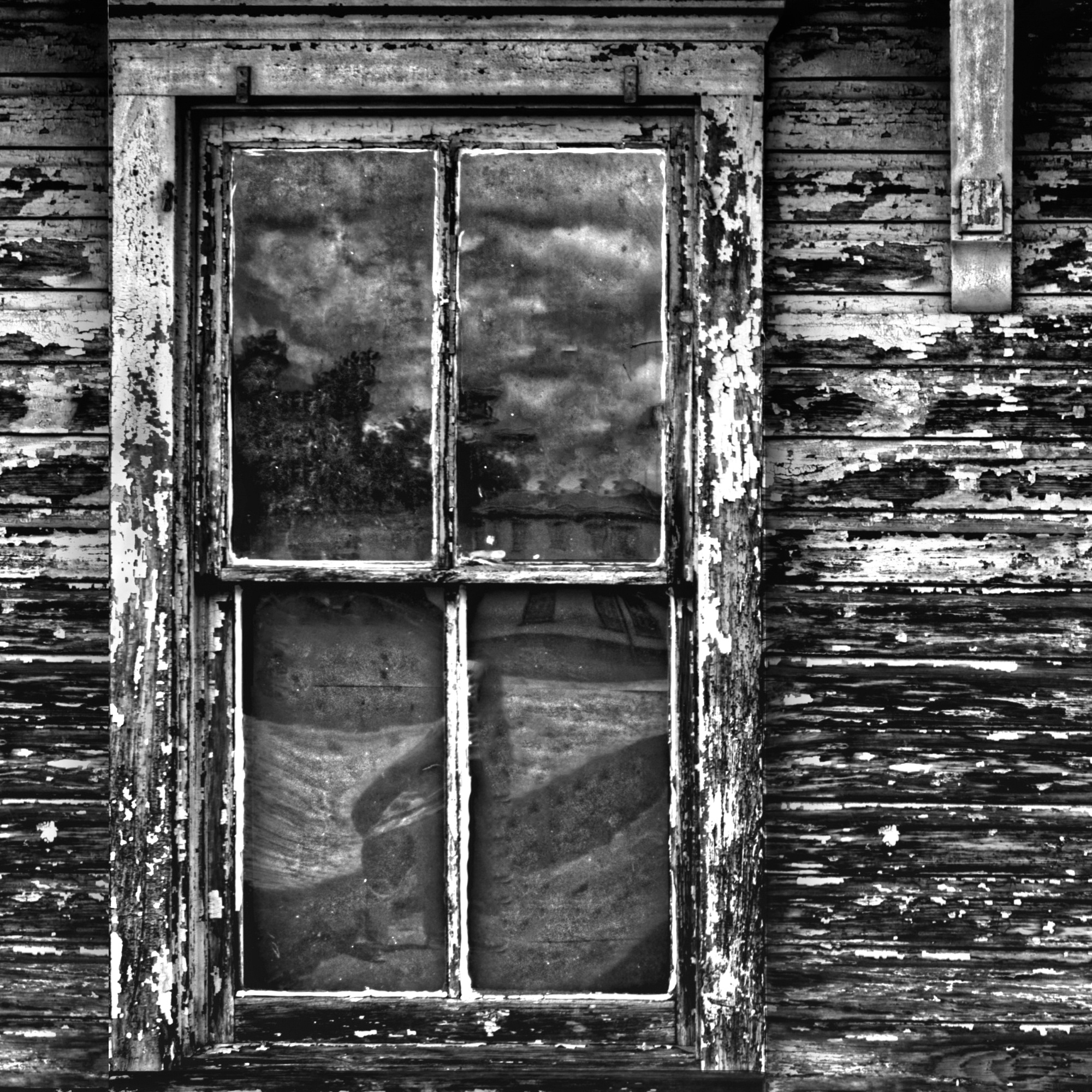
Welcome back to the forum, and thank you for sharing your Time Warp photo here. It is certainly full of history and stories, and the reflections in the window add interest to the weathered textures of the wood. Personally I didn't feel that the tones of the reflections worked very well with the earthy colours of the wood, so I converted the image to black and white. It's entirely up to you, of course, whether this version appeals or not, and you may have different suggestions from others.
Elizabeth
Thank you Elizabeth, it's definitely a 180, and i do like it!
Best regards, Patrick
Patrick,
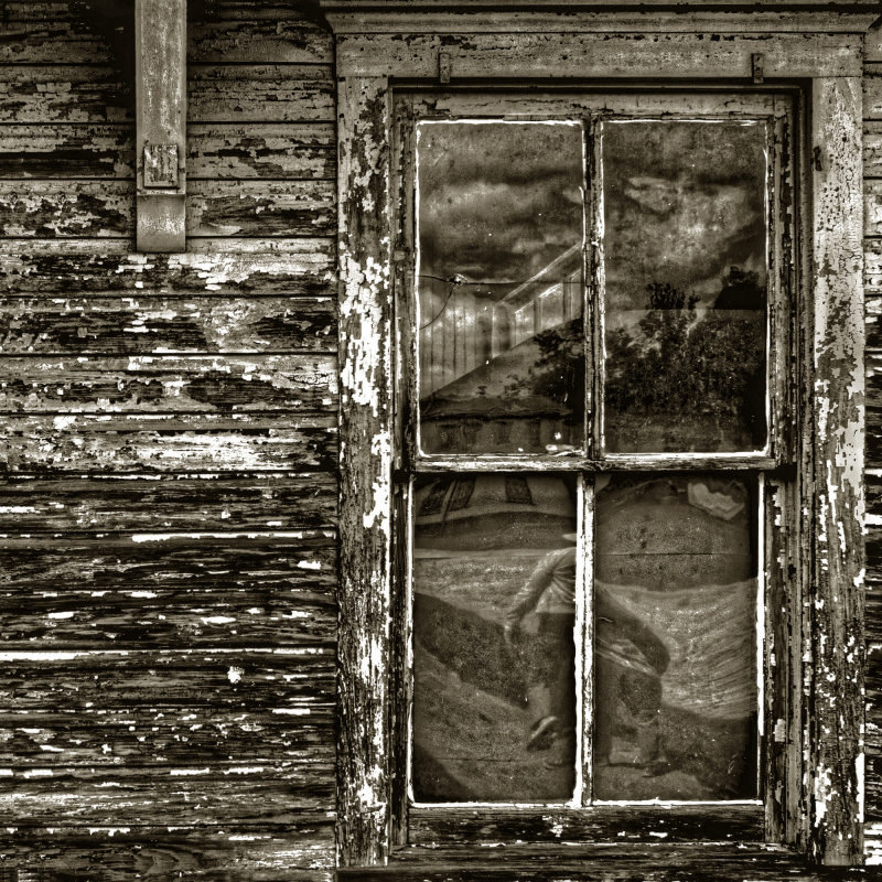
You know I am gone in Critique, but I promised you help if possible. Now you have here a nice but very dificult image. He is so busy. But I tried a few things. I will not say it is better but see if there are elements you can use. I tell you what I did. 1. I made a duplicate layer in Photoshop and moved the second layer to the right. 2. I repaired the left side as follows. A vertical rectangle on the right and than COPY>PASTE I brought this to the left. Make one layer and made a few small changes with the QUICK RETOUCH PENCIL to make it a little different. 3. With the QYICK RETOUCH PENCIL I remove things in the window you can see this below. and lightend a fraction 4. I selected the window and did COPY>PASTE this part you can give a shadow in Photoshop, make one layer. Now all is less flat. And I played a fraction with the colors but that is difficult, only you know the right colors. Up to you if you can use something, Theo Lu
Thank you Theo. I like what you did, especially with simplyfying the reflections. Great idea, definetly makes more sense. I agree the image is kind of busy with all the peeling paint. I think I might try a mono with your adddtional sugestions, maybe in a more vintage tone.
Thanks again!
Patrick
Thank you Theo. I like what you did, especially with simplyfying the reflections. Great idea, definetly makes more sense. I agree the image is kind of busy with all the peeling paint. I think I might try a mono with your adddtional sugestions, maybe in a more vintage tone.
Thanks again!
Patrick
Success it is in good hands ! I think the shadows may be also important.
kind regards Theo
Patrick,
If you want to see the B&W version like Elizabeth suggested.
Patrick,
Thank you for sharing the photo and information about Roebling, New Jersey. I learn new things here every day!
I like Elizabeth's suggestion to try monochrome, and Theo's work on making the composition less busy.
It's a wonderful subject for a texture study, and I think you chose a good title to suggest that it's an old, abandoned structure whose windows have reflected a lot of history. You kept the verticals and horizontals squared up, and the colours are unusual and interesting.
The image on my screen looks a bit soft. I see from the EXIF you used a good camera and lens at a fast shutter speed, optimum aperture, and moderate ISO. It could be an upload problem.
I'm curious about Affinity editing program - does it offer filtering options when making a conversion to black and white? Because the colours in your original are quite strong, and opposites - green and red, with some blue in the window reflections - it would be an interesting one to convert with filters. Photoshop has 12 filters, and each one seems to give the image a different mood - from dark and gloomy to bright and cheerful.
I took a screen capture and tinkered . . . . sharpened, converted to black and white, added sepia tone, lowered the contrast a little, and flipped the image left to right. * an alternate to black and white would be to de-saturate the colours - maybe they'd give a better impression of 'old' that way. Those are suggestions only - you're the photographer and should edit for what you want the photo to express.
. . . . . Steven, senior critic

Hello, Patrick Compagnucci
Welcome back to our forum. I read through your information on the image. The story behind the reflection and the buildings is really interesting. Years bear emotions and the more they pass the heavier the emotions get. We wear our experiences in our wrinkles. Buildings show their weight of years in their worn out color or maybe as you suggested it in reflections embedded in their windows. Well,truthfully I think the idea behind the image is stronger than the image I see. When I look at the image, I get a bit stressed. I think this is due to the harsh color and texture. The reflection grabs my intention but it is distracted through the hard texture around it. Another disturbing aspect is the tight crop around the window. The heart of the image is in the reflection but the space around it gets the main attention. I wonder what the image would reflect is the color and the texture were sudued in camera raw. Even in the subdued version I think we would have gotten the idea of the age of the building. I really would have preferred a wider space around the window. My colleagues did really good adjustments but I think the stressful nature of the image did not lessen. Have good light...
Cicek Kiral SC
Thank you Cicek, for your frank assessement. I can't disagree with a word you have said (all relavant issues). I have a lot of those same feelings about the image, that's why I posted it here in the critique forum. Thanks for your help
Warmest regards,
Patrick
Patrick,
Thank you for sharing the photo and information about Roebling, New Jersey. I learn new things here every day!
I like Elizabeth's suggestion to try monochrome, and Theo's work on making the composition less busy.
It's a wonderful subject for a texture study, and I think you chose a good title to suggest that it's an old, abandoned structure whose windows have reflected a lot of history. You kept the verticals and horizontals squared up, and the colours are unusual and interesting.
The image on my screen looks a bit soft. I see from the EXIF you used a good camera and lens at a fast shutter speed, optimum aperture, and moderate ISO. It could be an upload problem.
I'm curious about Affinity editing program - does it offer filtering options when making a conversion to black and white? Because the colours in your original are quite strong, and opposites - green and red, with some blue in the window reflections - it would be an interesting one to convert with filters. Photoshop has 12 filters, and each one seems to give the image a different mood - from dark and gloomy to bright and cheerful.
I took a screen capture and tinkered . . . . sharpened, converted to black and white, added sepia tone, lowered the contrast a little, and flipped the image left to right. * an alternate to black and white would be to de-saturate the colours - maybe they'd give a better impression of 'old' that way. Those are suggestions only - you're the photographer and should edit for what you want the photo to express.
. . . . . Steven, senior critic
Thank you Steven, I really like what you came up with. One of my concerns with this photo was that it was way to soft for what I was trying to achieve, what you have done improves it immensley. I like it!
Affinity has many of the same tools as photoshop, however, I don't know about the conversion filters. If they are there, I have not discovered them to date, i will take a serious look.
I have not been really comfortable with this image, so I'm glad I submitted it to you guys. lots of great suggestions and opinions.
You guys are the best!
Regards, Patrick
Dear Patrick,
Good to see you back and thanks for submitting this photo to the critique forum. It is a category of urban decay which I like very much. This photo is powerful color wise and quite coarse which makes it in my view harder to amend it in a way that will give a much-improved result in a color version. I like the suggestions of Elizabeth and Steven.
A small observation, It seems to me that the window is located to close to the frame, so I added a bit on the bottom, top and on the left side by applying content-aware in Photoshop (under edit and fill).
I hope this may help a bit. It is of course just my opinion. Yours is the one that matters.
Kindest regards.
Arnon Senior Critic
Thank you Arnon for taking the time to comment and adding your insights. I am going to try and rework this image using many of the helpful suggestions. Hopefully I can come up with something, and if i do i may take a shot at curation.
Thanks again my friend!
Patrick
