
|
|
|
|

Hello everyone,
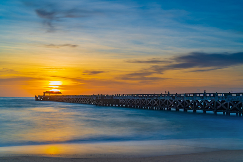
My idea for this photo is to place the pavilian at the sun. I tried to use the bridge leads to the pavilian and sun. At the lower area, I would like to add the beach into the frame a little bit. My intention is to show the transition from the wave of water, the wet sand and dry sand.
Please feel free to let ne know your feedback.
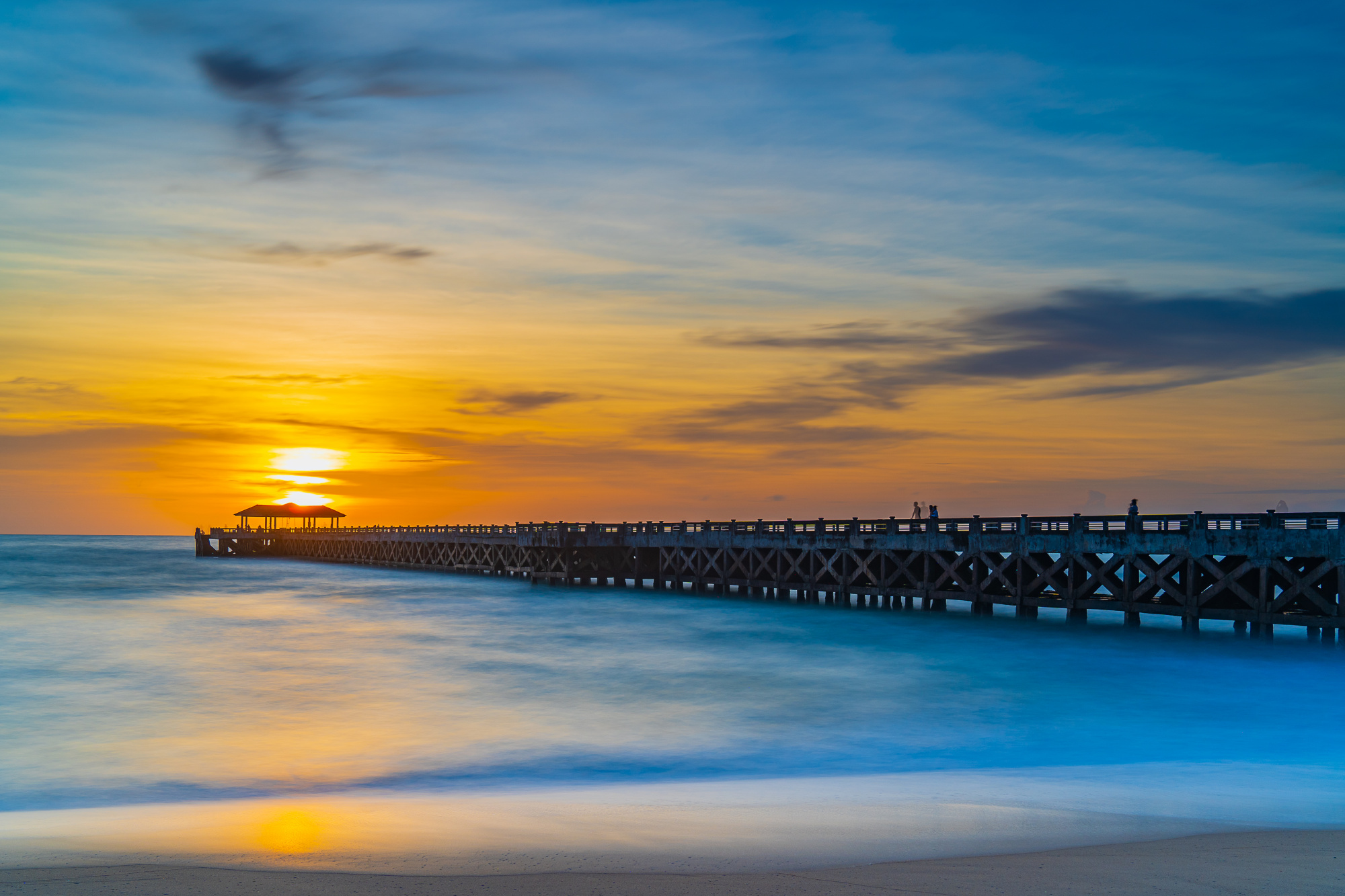
The leading line towards the sun is very good. Also, there is quite a good separation between all the elements in the photo.
Tepsarit,
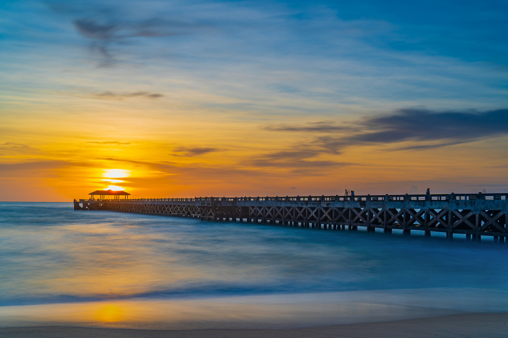
Thank you for sharing the photo with us here in Critique. It is a nice beach scene with vivid colours. The technical details look good - sharpness and depth of field, and the horizon looks level. I don't know what the shutter speed was, but it must have been several seconds to blur the water so nicely. I see one person on the pier has a double image as they moved during the exposure.
I'll make only one suggestion for further editing. The foreground is very bright compared to the sky. I think the scene would look more realistic if it were darker. Painters have a guideline about reflections - light objects will appear darker in a reflection, and dark objects will appear lighter in the reflection.
I've made a quick edit from a screen shot to show you what I mean. I darkened the bottom of the frame and also de-saturated the blue water just a little.
You're the photographer so you make the editing decisions. I'm just offering some ideas for you to try out.
- Steven, senior critic
PS: one last idea is to flip the image left-to-right to see if the composition flows better that way. It's often said that we read images left to right, so it might seem more natural to have the sunset happening on the right.