|
|
|
|
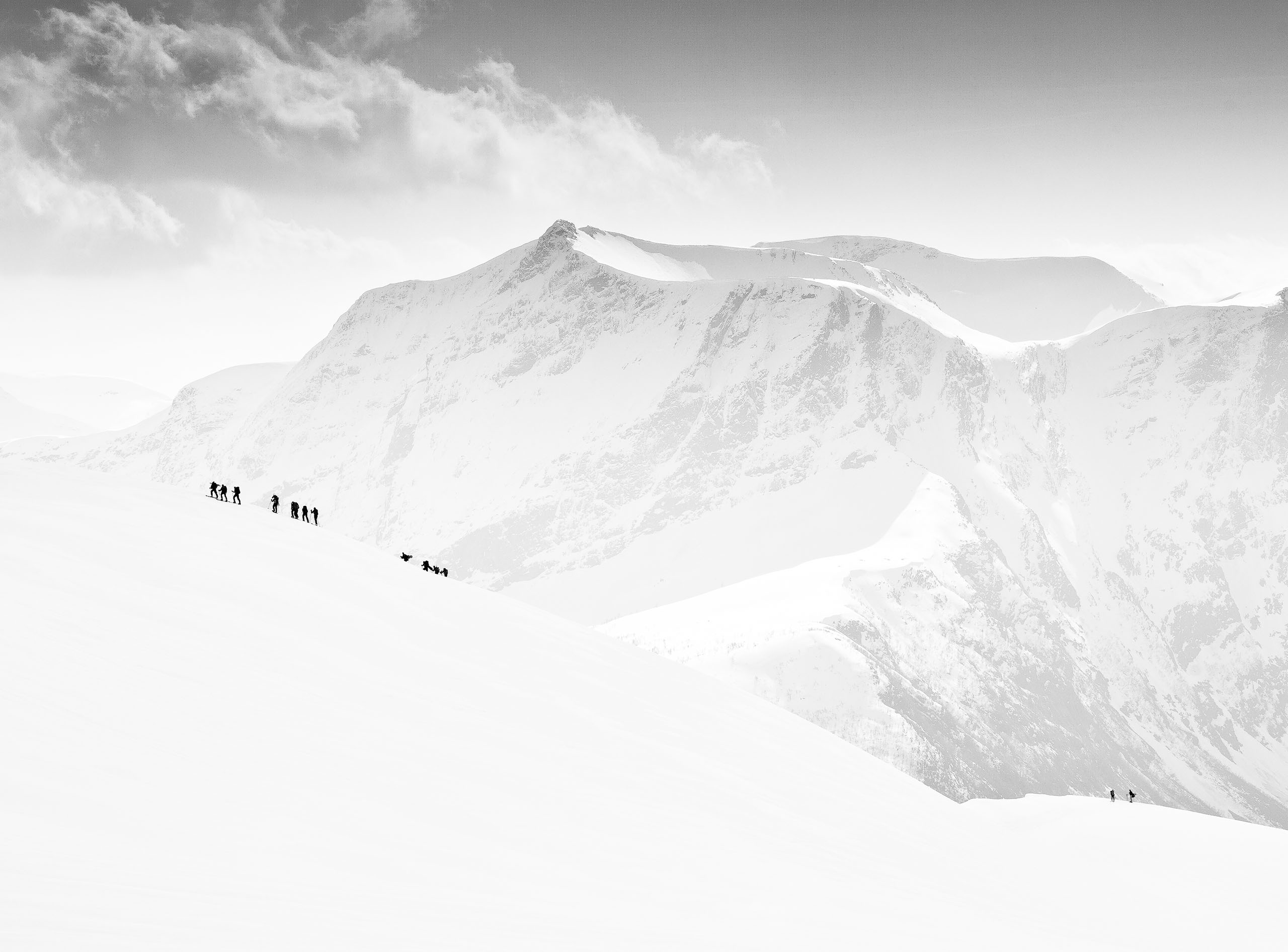
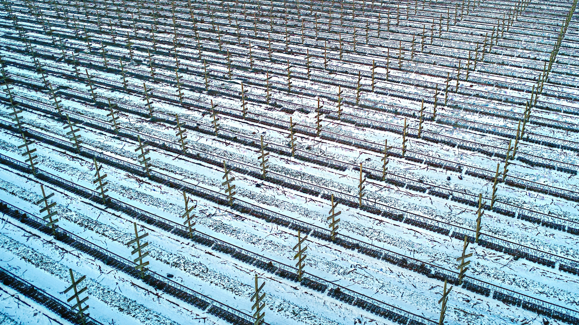
This photo is taken with a DJI Mini 2 drone, and the idea behind it is to have an abstract photo of a winter landscape. The photo is taken above a strawberry field that is being prepared for the spring. You see the wooden constructions that have wire between them which will guide the strawberry plants. The camera settings are 4,49mm, f/2.8 , 1/30sec and ISO100, 3 pictures have been taken with EV0, EV-0.7 and EV+0.7 and stacking these into an HDR kind of photo. Next using Luminar Neo I have edited the photo, made it a bit sharper, added some contrast. What I would like to learn is whether a photo like this is interesting enough to an audience.
Thank you,
Dick

Hi Dick,
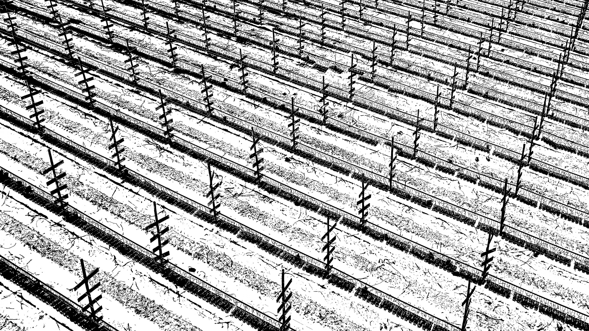
My tip: more abstract, more minimalist - get to the point:
Greetings
Udo

Hello, Dick Mandemaker . Welcome to our forum. Thank you for uploading this nice winter scape. I will try to answer your question from my point of view. There is no reason why this photo should not be interesting to people. First of all people who are interested in landscape and abstract photography will be attracted more than others. Then from my point of view, seeing the diagonal lines and the wooden posts, I think this image attracts quite some attention. Udo Dittman gave you a nice advice. I also find the closer look, and the black and white simpler look much more attractive. I think this enhances the abstract side of your image. Converting it into black and white evened the color difference. Likewise, it made it clearer to the eye. I would also advise converting the image into black-and-white. I wish you good light. Cicek...

Hello Dick
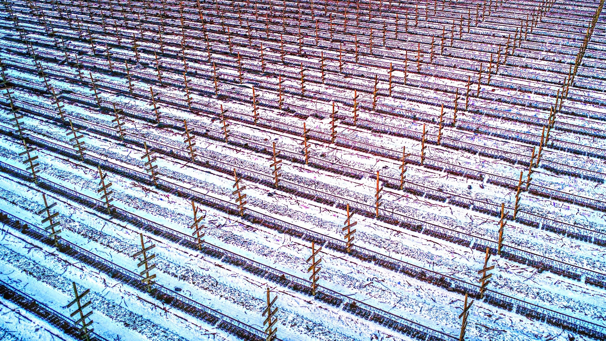
Thank you for sharing your drone image of winter strawberry fields with us. It appeals to me, and photos with repeated patterns often do well on 1x. I like Udo's monochrome, simplified version, but I also like the feeling of the extensive area in your original. I felt that the blue areas gave the cold feeling of winter but I noticed a subtle pinkish hue in the centre and wanted to emphasise that as a reference to strawberries. So I have kept your frame as it is, but I have enriched the pink tones.
Good light, Elizabeth
Hi Udo, Çiçek and Elizabeth,
Great that you all respond so fast, and also to the point. I really learn a lot from the feedback.
Udo's version of my photo is surprisingly beautiful, I would never dare to go this far in editing, but now I know that it can pay off!
Elizabeth's pinkish version is also a nice variation, yet for this picture a black and white photo is more suited.
Thank you all!
Dick
Hello again, Dick Mandemaker,
I like this far more than your coastal shot. It's the right mix of visual appealing lines, repetitions and the mystery what we see here. Since we don't have any reference for dimensions, it's quite unlikely we will find out what it is you photographed. But it's like a challenge, and our brains like to be challenged when we see photographs of this kind. So it caught me for far more than just a fraction of a second, even if it was not posted in critique.
I like Liz's duo-tone gradient approach, but it's not necessary to catch me. I wish you good luck with this shot in curation!
Best regards,
Mike
