|
|
|
|

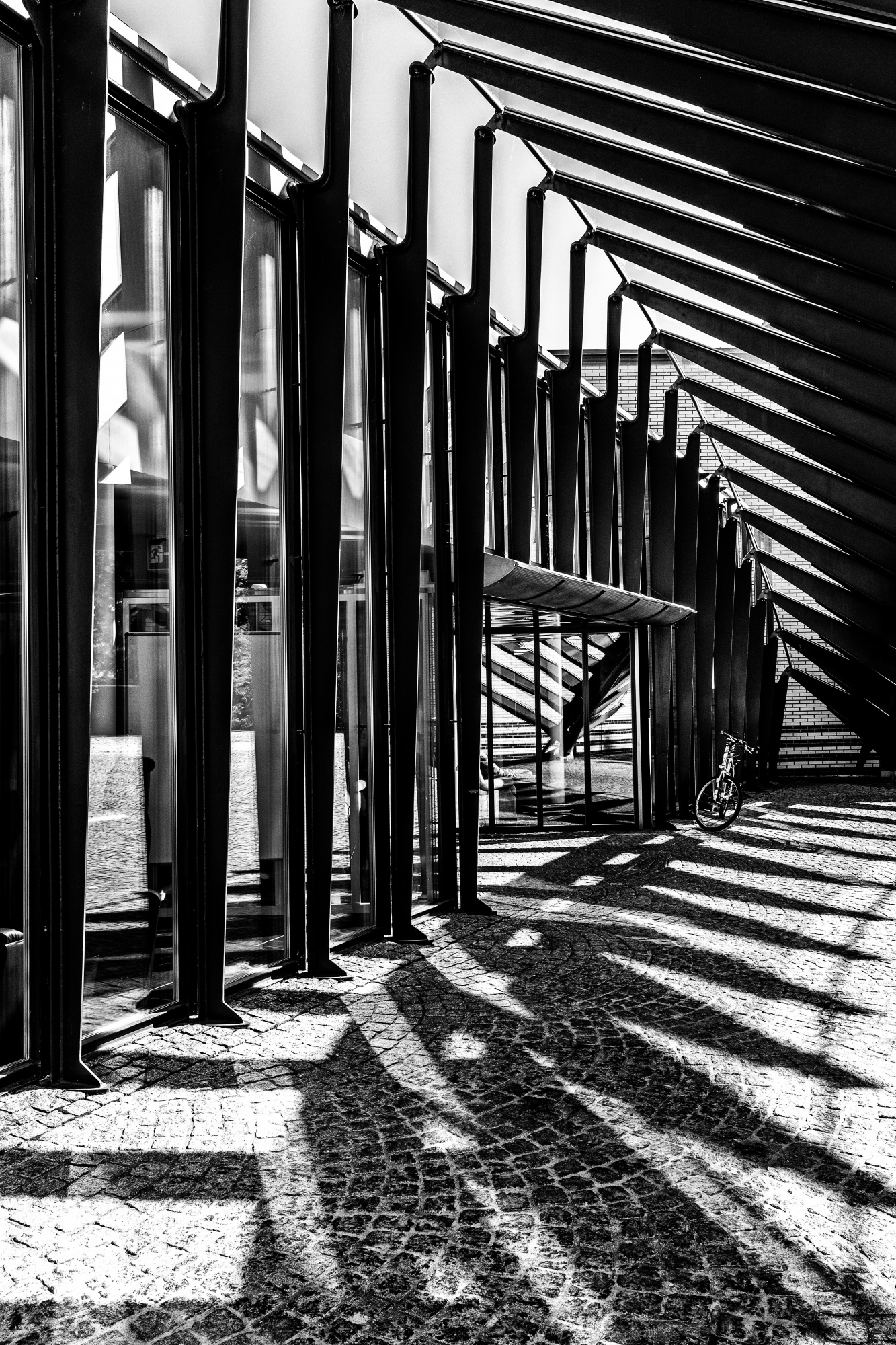
With this photo, I have found that many members liked it, but finally it was not published. Since I always want to improve, I am very interested in the opinion of other photographers.
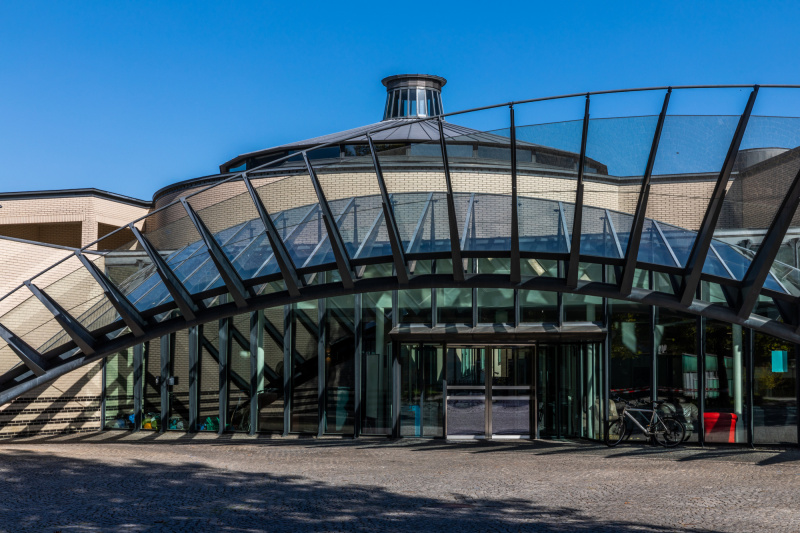
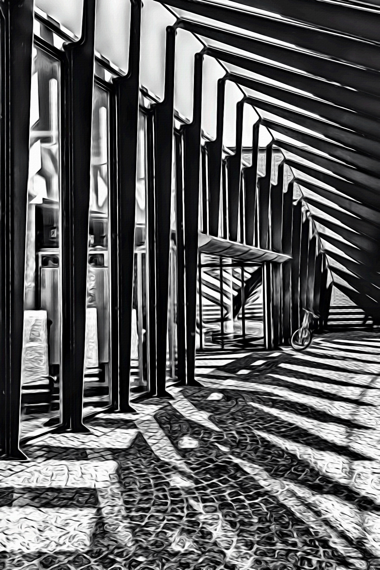
Here you can see the entrance area of a school designed by Santiago Calatrava. Ribbed constructions are a typical feature of Calatrava and in my shot the intention was to show the construction and the shadows created. The contrast and the monochrome processing were to increase the effect.
I thank you for any constructive feedback.
focal length: 28mm
aperture: f/16
shutter speed: 4.64s
ISO: 100
processing tools: PS and NIK silver efex
tripod used
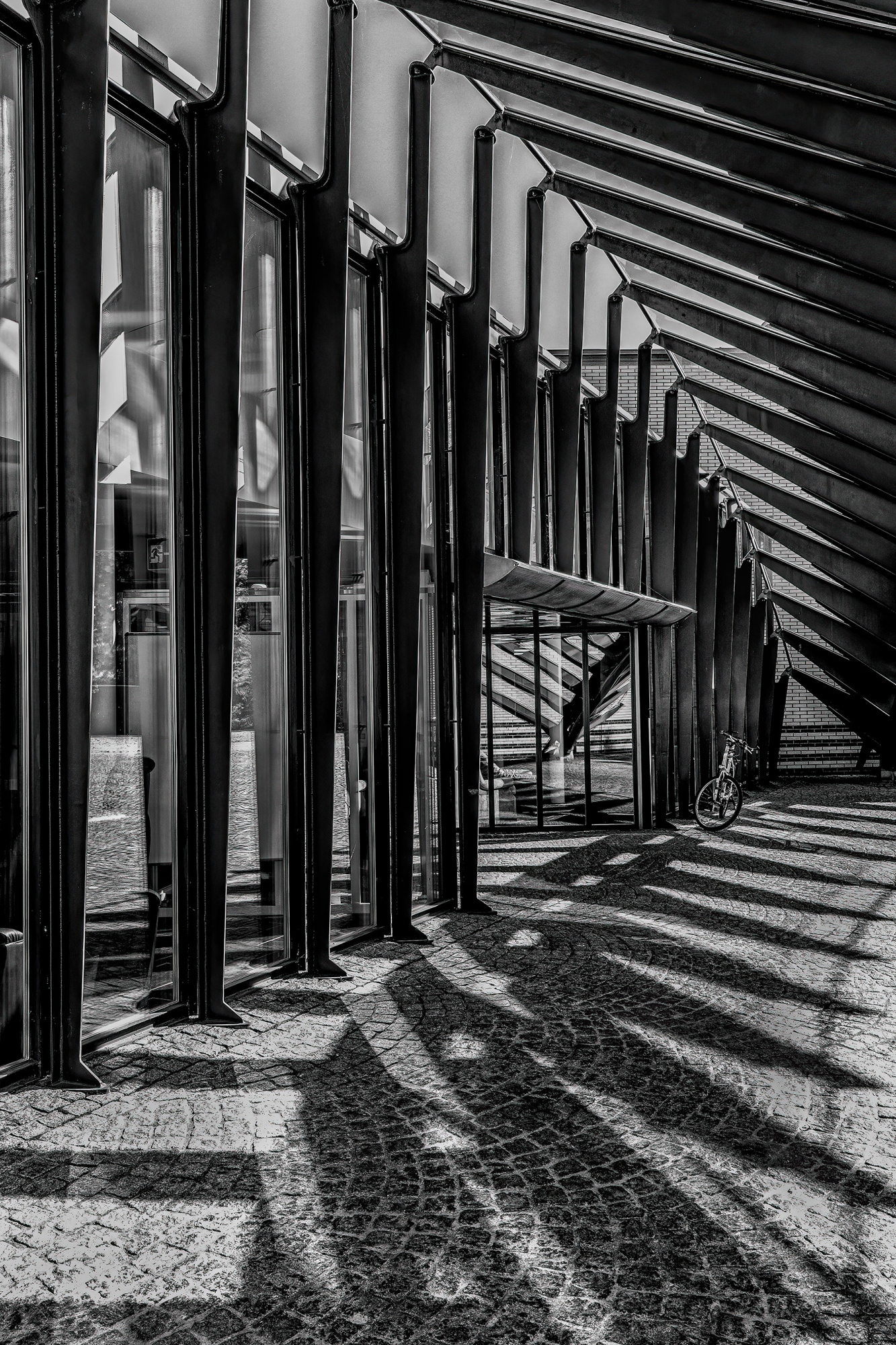
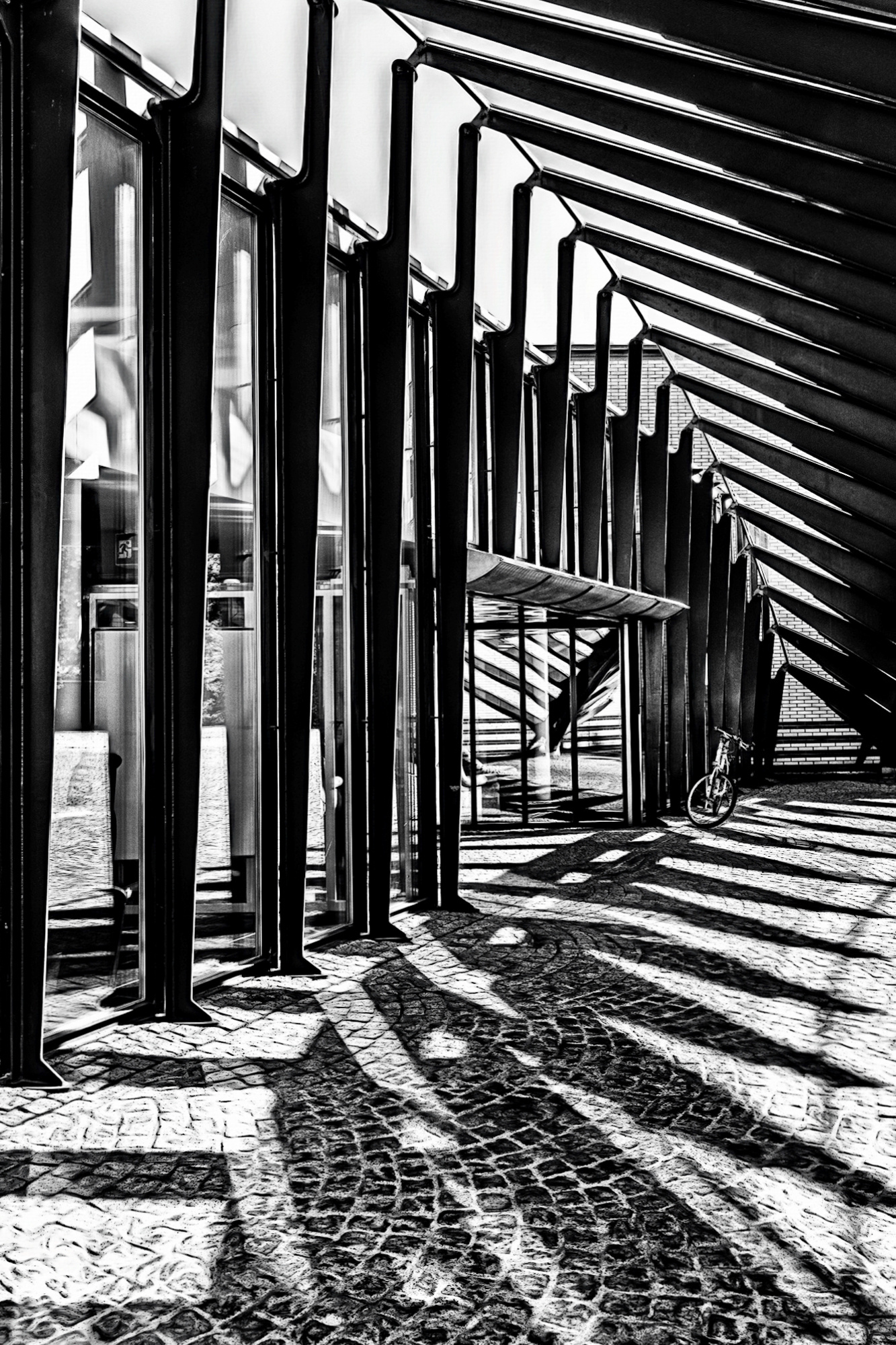
Urs welcome good capture well done. I have taken your image back into Photoshop / Camera raw just to see up close. I found your contrast and highlights a problem with blown white in the floor. So I had a play with three slders Shadows opened up a little and toned down the highlights and white followed by the burn tool and areas of the floor. - I made it too low contrast as I wanted to use Nik Tools Tonal Contrast to add impact and put some back. Last Topaz AI sharpen with noise reduction.

Good Morning Urs,
i first turned my attention to the geometry and changed it in Photoshop Elements so that the light lines in the beams are vertical and the brick edge in the background is exactly horizontal. I also distorted the image a bit so that it starts with a dark beam on the left. I then used a pseudo-HDR filter to increase the dynamic range of the photo a bit.
Result:

And now it gets spooky :-)
To give the image a further touch and to strengthen the contours I have now created a painting version from the image:
I then overlaid this with 33% darkening over my first version. Since the white was not white enough for me afterwards, I lightened the result with a duplicate at 50%.
Final result:
Best regards
Udo
Urs welcome good capture well done. I have taken your image back into Photoshop / Camera raw just to see up close. I found your contrast and highlights a problem with blown white in the floor. So I had a play with three slders Shadows opened up a little and toned down the highlights and white followed by the burn tool and areas of the floor. - I made it too low contrast as I wanted to use Nik Tools Tonal Contrast to add impact and put some back. Last Topaz AI sharpen with noise reduction.
Thank you very much for looking into the photo, dear Daniel. It's always interesting to see that there are different ways to improve a photo. Best regards, Urs
Good Morning Urs,
i first turned my attention to the geometry and changed it in Photoshop Elements so that the light lines in the beams are vertical and the brick edge in the background is exactly horizontal. I also distorted the image a bit so that it starts with a dark beam on the left. I then used a pseudo-HDR filter to increase the dynamic range of the photo a bit.
Result:
And now it gets spooky :-)
To give the image a further touch and to strengthen the contours I have now created a painting version from the image:
I then overlaid this with 33% darkening over my first version. Since the white was not white enough for me afterwards, I lightened the result with a duplicate at 50%.
Final result:
Best regards
Udo
Many thanks for the creative engagement with my photo, dear Udo. I like the "spooky" version and your suggestions. Best regards, Urs
Urs,
I did following: a crop for more attention to the right, I removed some white on the left wall and made that area darker, to make that side more quiet and I darkend the right area. Theo L.
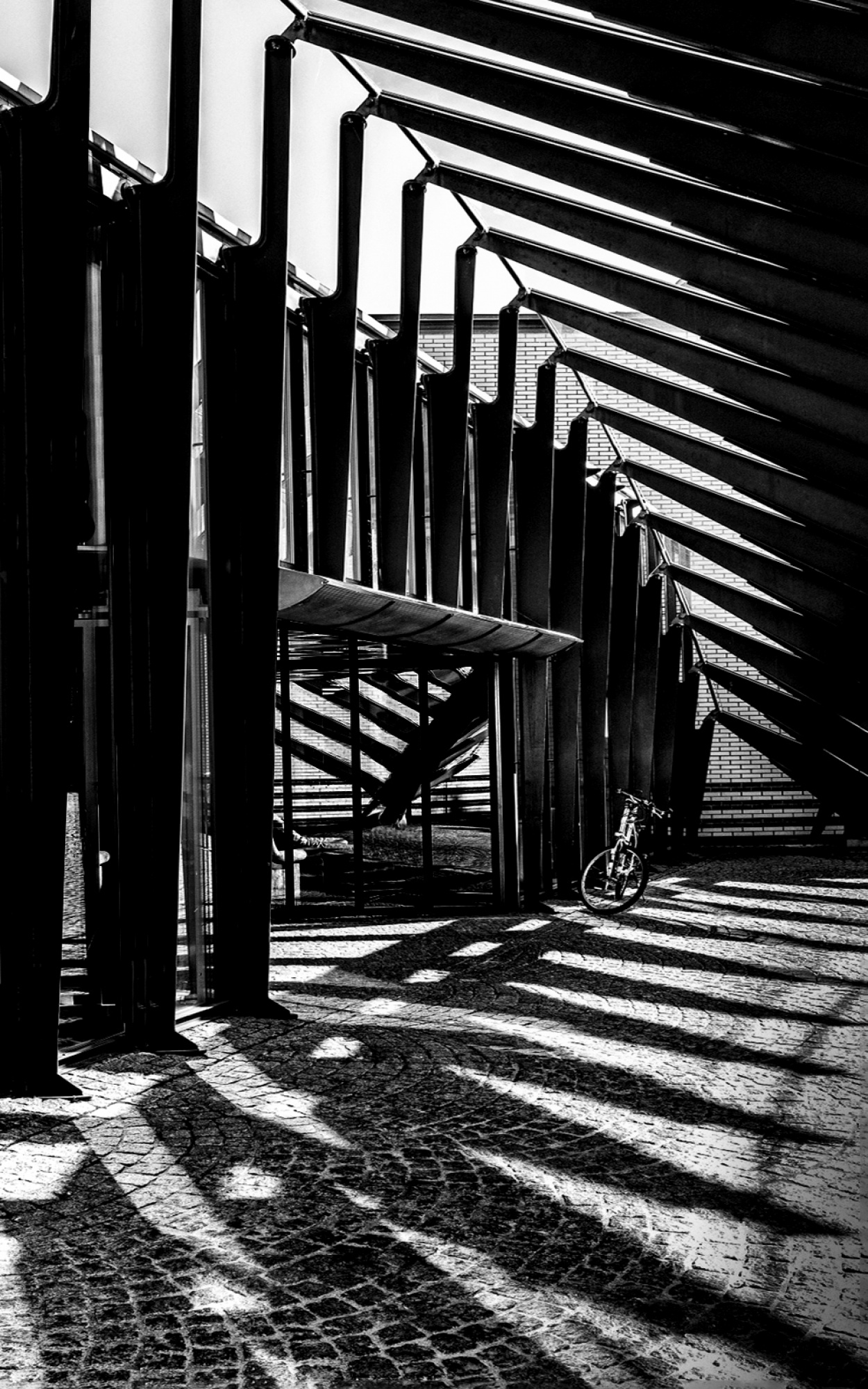
PS. You can make this composition lighter or darker.
Urs,
I did following: a crop for more attention to the right, I removed some white on the left wall and made that area darker, to make that side more quiet and I darkend the right area. Theo L.
PS. You can make this composition lighter or darker.
Thank you so much for looking at the photo, dear Theo. The increased contrasts are a good alternative to my picture. It was also important for me to bring out the light and dark. Best regards, Urs
Hello Urs, hope you don't mind my thoughts here. While I like many of the edits posted here, and you can clearly see how many directions you can take an edit, I don't think they would result in your image being published.
The subject of you image is solely the geometry of the architecture, but it's almost shot in a street photography way. For architecture shots you need to really simplify the image and work on the composition to nail it and for Street photography it's lacking the human element to anchor the image.
I'd strongly suggest going back to this location and shooting it more as it has a ton of potential. I'd also focus on finding a human subject to frame in the light and shadows to anchor it, maybe somebody coming in from outside with an umbrella etc.
Thank you Brad, I appreciate your comment. For me, the focus was definitely on the architecture and I wanted to choose a special position rather than a general view (see attached photo) because I find Calatrava's architecture very special. As a street it would of course be interesting too and I will gladly try that, because the holidays are over now :-).